Yesterday saw over 200 new cases confirmed Australia-wide, meaning that the rate the virus is spreading continues to increase.
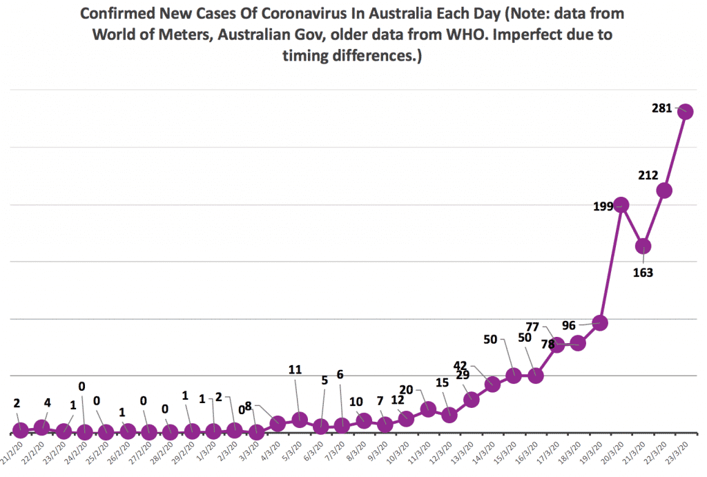
With total Australian cases at 1,353 according to world of meters, we can see an acceleration of infection.
Comparing the numbers of confirmed cases with those of Singapore shows the gravity of the failure.
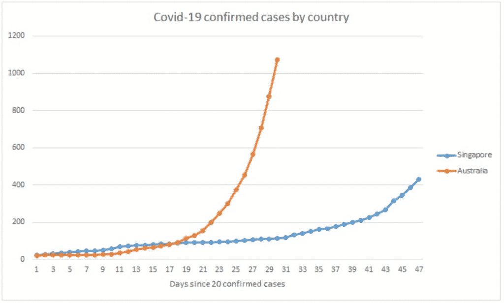
Singapore is benefitting now from the lessons learned during the SARS outbreak, but has no particular advantage in terms of wealth or technical expertise. Australia’s first case was actually four days after Singapore’s.The difference is one of government, strategy and leadership.
The good news is that just because the situation is out of control now, that doesn’t mean it will stay that way. After appearing to have the virus contained, South Korea experienced a similar sort of take-off to what Australia is now going through.
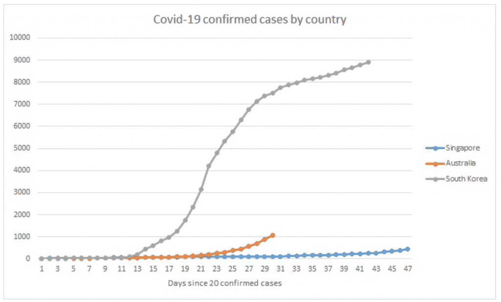
From 26 February when it had 1,200 cases, roughly where Australia sits now, South Korea reached 7,000 cases over the next 10 days. However from there, the growth in new cases per day was slowed down to around 1 per cent. Their current total of 9,000 cases has amounted to 104 deaths so far.
According to a 2018 report, Australia has 2,200 intensive care unit beds. So we need to learn from South Korea and Singapore, and fast.
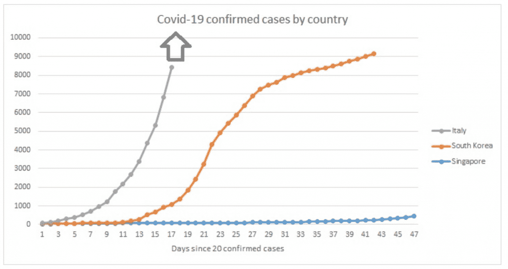
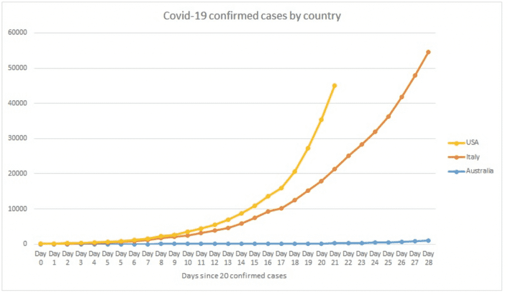
If we don’t, there are far more dire scenarios in store. At Day 18, Italy went off the chart. The country is currently attempting to cope with over 53,000 cases. More than 5,000 people have died, and each day more people die than the last.
But if Italy is a car crash, one country is a speeding, out-of-control train with no-one at the wheel. The crash that awaits it at the end is anybody’s guess, but it doesn’t look good to us.
