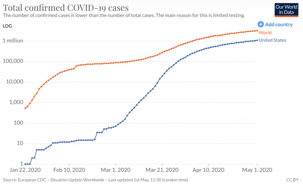
There can be no doubt that lockdowns in the USA (and throughout the world) have done much to slow the spread of coronavirus cases. The next three charts are from Our World In Data.

However, while the log scale graph of cases does a lot to show how the rate of infection is slowing it probably doesn’t do a great job showing the mounting human cost.
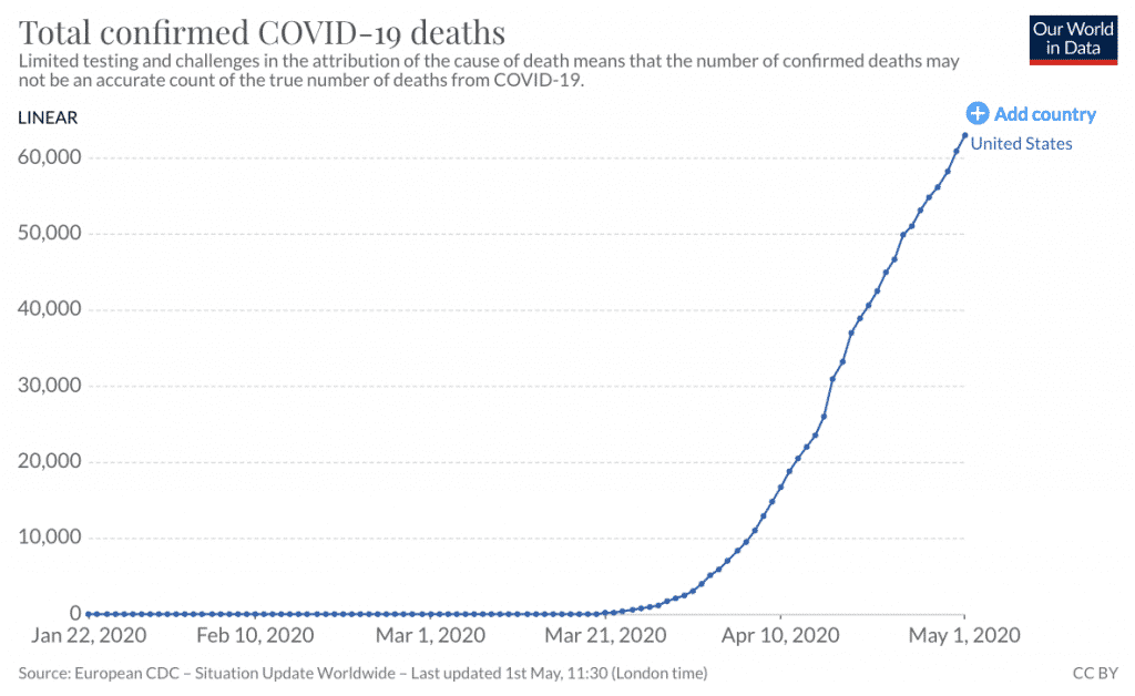
And as you can see below, the death toll in the USA is very high and climbing. Ultimately, large death tolls will stop a country getting back to work because large death tolls are scary (for good reason).

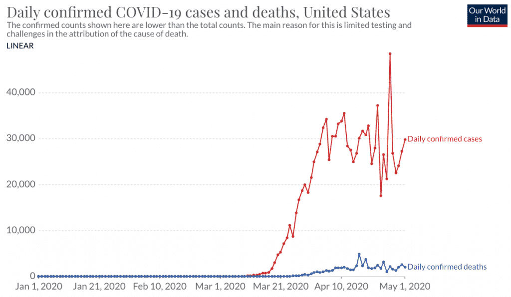
At the moment the US is keeping their rate of infection fairly steady, as you see below.

Essentially, the USA is flattening the infection curve, but not crushing it. The fact is they flattened it so late that the deaths will keep mounting at an alarming rate, around 2,000 a day, at present.
That means about 60,000 a month, or 360,000 more dead by the November presidential election in the USA. I wonder if that would be more problematic to voters than a stock market crash. And if it is judged to be so, I wonder what the ramifications will be for government policy in the USA.