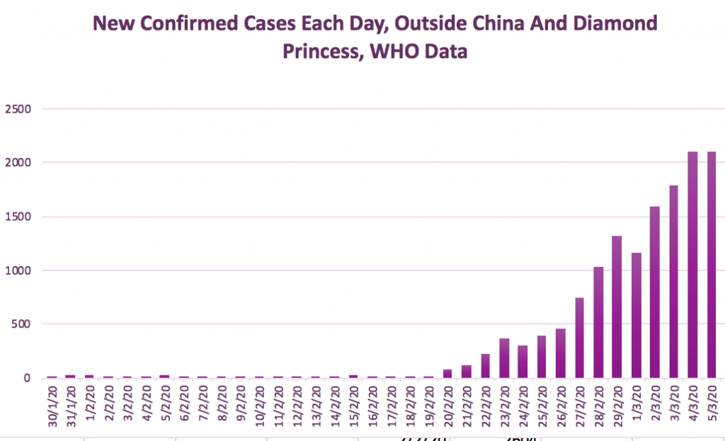
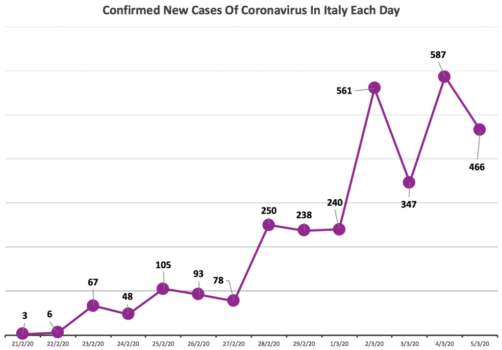
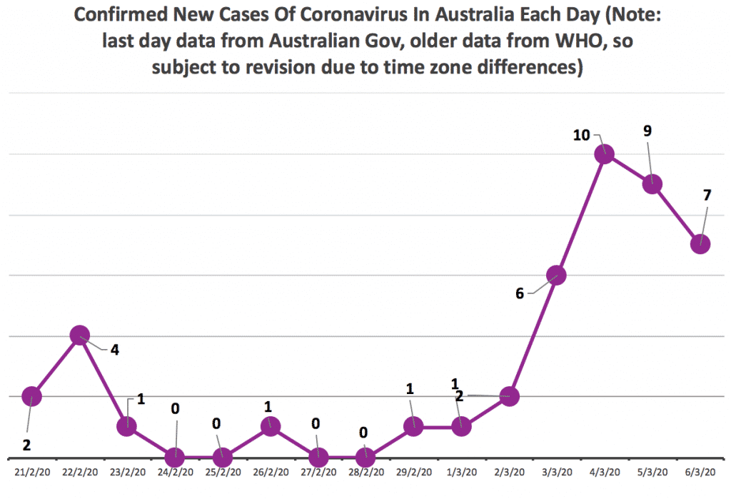
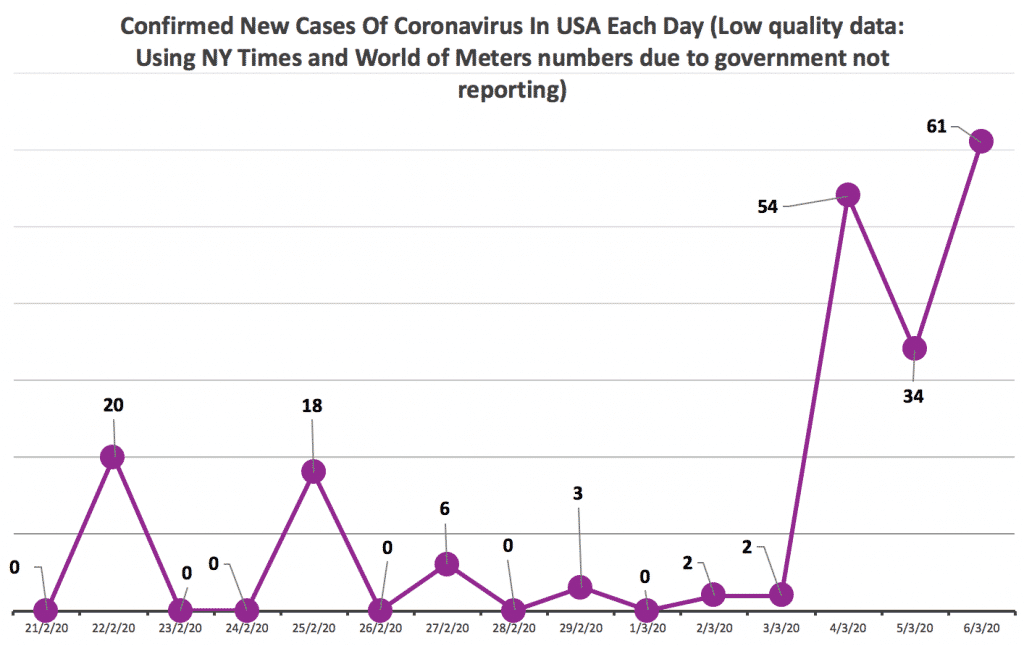
At this point I feel I should put a big fat caveat in front of these Coronavirus charts to say that I do not fully trust this data. There’s a huge difference between how thoroughly countries are testing their populations, how quickly they update data, and how much information they give. For the ‘world outside China’ I have used WHO data, which is fundamentally flawed in many ways.
For example US data published by the New York Times predicts official data by more than 24 hours, presumably because the government is simply not reporting properly. Meanwhile, Iran’s data is nothing short of a joke. Australia’s data is sometimes timely, sometimes not.


