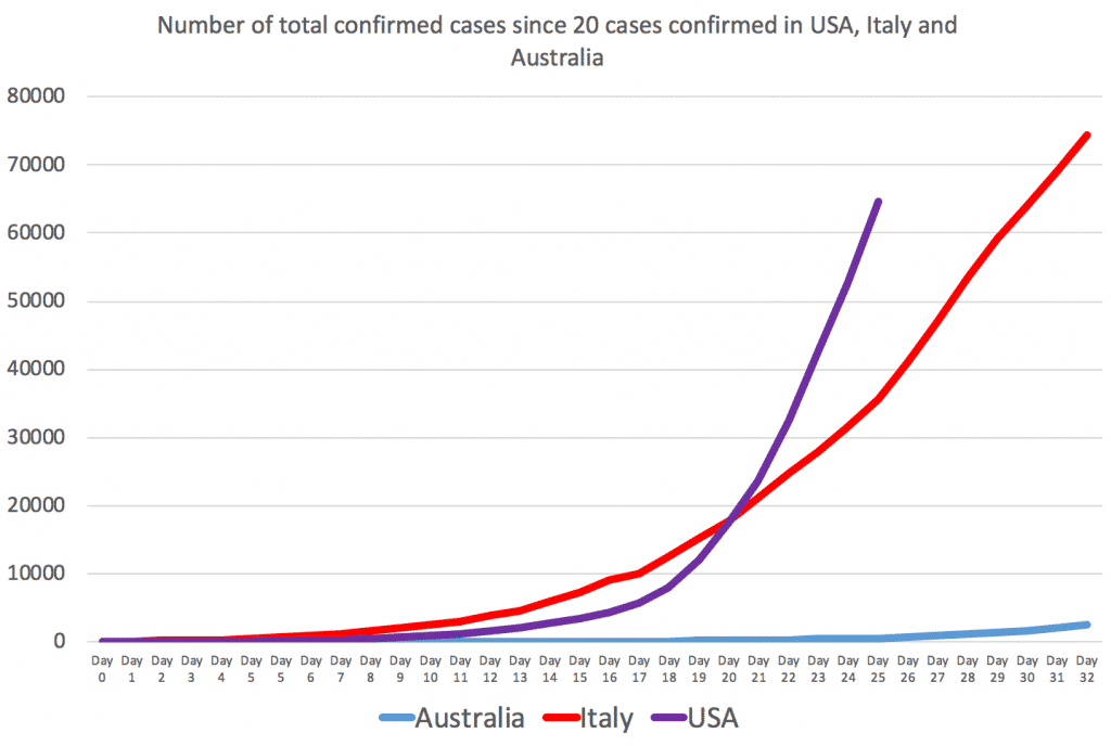
As you can see in the below, chart, made using Wikipedia data, the USA is very much on track to have a worse COVID-19 outbreak than Italy.

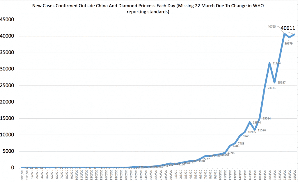
Meanwhile, the number of confirmed cases worldwide, as reported by the WHO looks to be flattening, but it’s only because (bizarrely) they changed from reporting figures at 11:59pm to 10am, essentially missing out a day.
I would expect these numbers to begin to climb strongly again soon.

Keep in mind that Wikipedia data is collated from various state sources so while it may at times be slightly inaccurate, it’s usually considerably faster and smoother. The WHO seems to wait for national governments to report collated numbers so it can be much lumpier, and usually lags behind the facts.